Web design is more than visuals.
It’s about connection.
IAM Tech Day
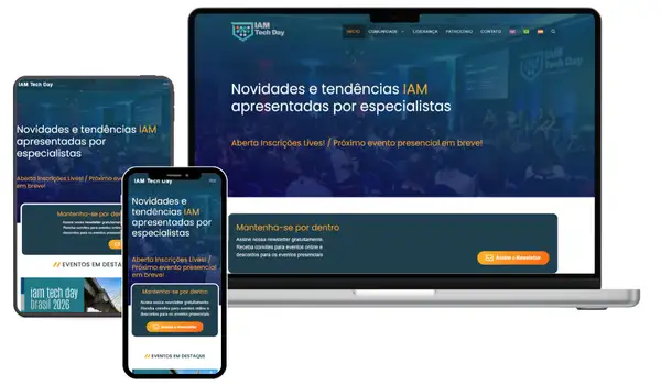
The original website was built by the event producer himself, neat, charming, and full of expectation. But as the event grew, so did the challenges. The platform needed to evolve with better performance, stronger SEO, hosting ready for thousands of visitors, and a great mobile experience. It also had to support multiple events and highlight community initiatives that extended beyond the main conference. It was time for something stronger. They called Ei!.
Vida Nutri • Dr. Flavia Libonati
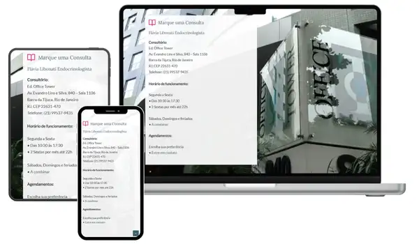
Dr. Flávia started from zero, determined to build a digital presence that could inspire and guide people toward healthier living. Our mission was to plan a clear strategy, build a modern website with warm, inviting tones, and position it as the main connection between her and her readers. The platform was also designed to interact and share content with her Instagram community, creating a seamless bridge between social engagement and in-depth information.
Features
SEO, Modern, Responsive, Mobile First, Tailored Scripts, Blog Enabled. Fluid content.
Prates Contabilidade
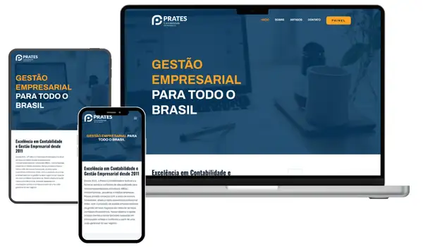
Prates Contabilidade is a well-established and trusted accounting firm from Paraná, Brazil, supporting businesses since 2011. Their previous website met essential institutional needs but offered limited room for interaction or long-term growth. With our strategic guidance, Prates chose to invest in a digital platform designed to evolve, strengthen client connections, and scale alongside the business. Explore the project to see how this transformation took shape.
What We Delivered
The project included strategic consulting, SEO and SWOT analysis, and a tailored marketing action plan, alongside the development of a fully optimized website with integrated SEO. We implemented a modern, easy-to-manage content system and a clean, user-focused design, ensuring both performance and long-term maintainability.
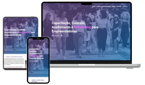
Curitibana Business
Curitibana Business was founded by Ana and Luciana to empower women through organization, professional training, and the strength of community collaboration. They came to Ei! seeking a website designed specifically to serve the needs of their growing network, a platform that could foster connection and growth. Our previous experience leading Google Business Group Curitiba was a key differentiator, allowing us to translate years of community-building into a digital experience built for engagement and impact.
IAM Tech Day
The original website was built by the event producer himself, neat, charming, and full of expectation. But as the event grew, so did the challenges. The platform needed to evolve with better performance, stronger SEO, hosting ready for thousands of visitors, and a great mobile experience. It also had to support multiple events and highlight community initiatives that extended beyond the main conference. It was time for something stronger.
They called Ei!.
